A Design Critique of the Dynalist App
2018-12-19
Author's Note: I wrote this to be an example of a detailed design critique for my HCI students, one that uses usability vocabulary and brings up perceptual and cognitive principles. I welcome any suggestions for improvement.
My Journal, My Notes, and I
It would not be an overstatement to say that I'm obsessed with note-taking systems. I've kept a personal journal for almost 17 years - for more than half my life - and have developed a system for it: I would jot down events and thoughts during the day, then in the evening (or over the weekend) I will revisit them to write my journal in full sentences. Although I still carry a paper notebook with me most days of the week, now I tend to write them either on my clipboard, or more likely, through a note-taking app on my phone.
Strangely though, I've never found a note-taking app that I've liked. I suspect it's because I've grown so accustomed to vim bindings that nothing felt equally intuitive. I've tried a lot of apps: Evernote, Ginko, Google Keep, Notational Velocity, Orgzly, TiddlyWiki, WorkFlowy, Wunderlist, Zotero - none of them fit how I take notes, and I always felt slowed down by the app.
So earlier this year when I discovered a new note-taking app, Dynalist, I installed it out of idle curiosity and with no real expectations. But within a month, it replaced my previous app (Orgzly). I even used their API to write a script that syncs Dynalist to my computer and vice versa. Why did Dynalist succeed where other apps failed?
The Competition: Orgzly and WorkFlowy
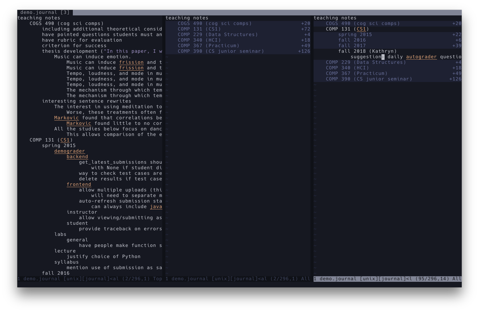
To understand why I like Dynalist so much, I have to explain how I usually take notes first. On my computer, my notes are simple in a text file, and they essentially form a nested list. This means that in addition to adding things above and below a line, I can move entire "sublists" up and down, and also indent and "dedent" those notes. This nested list system is even more powerful when combined with vim's folding features. I can collapse the "sublists" and hide them from view, and only expand them as necessary. In practice, I use this feature a lot to get around a long document, as well as to get some context around what I'm writing. It also helps minimize the amount of distracting text on screen.
In short, my ideal app would let me add text, move text around, and zoom in and out of the lists with minimal friction.
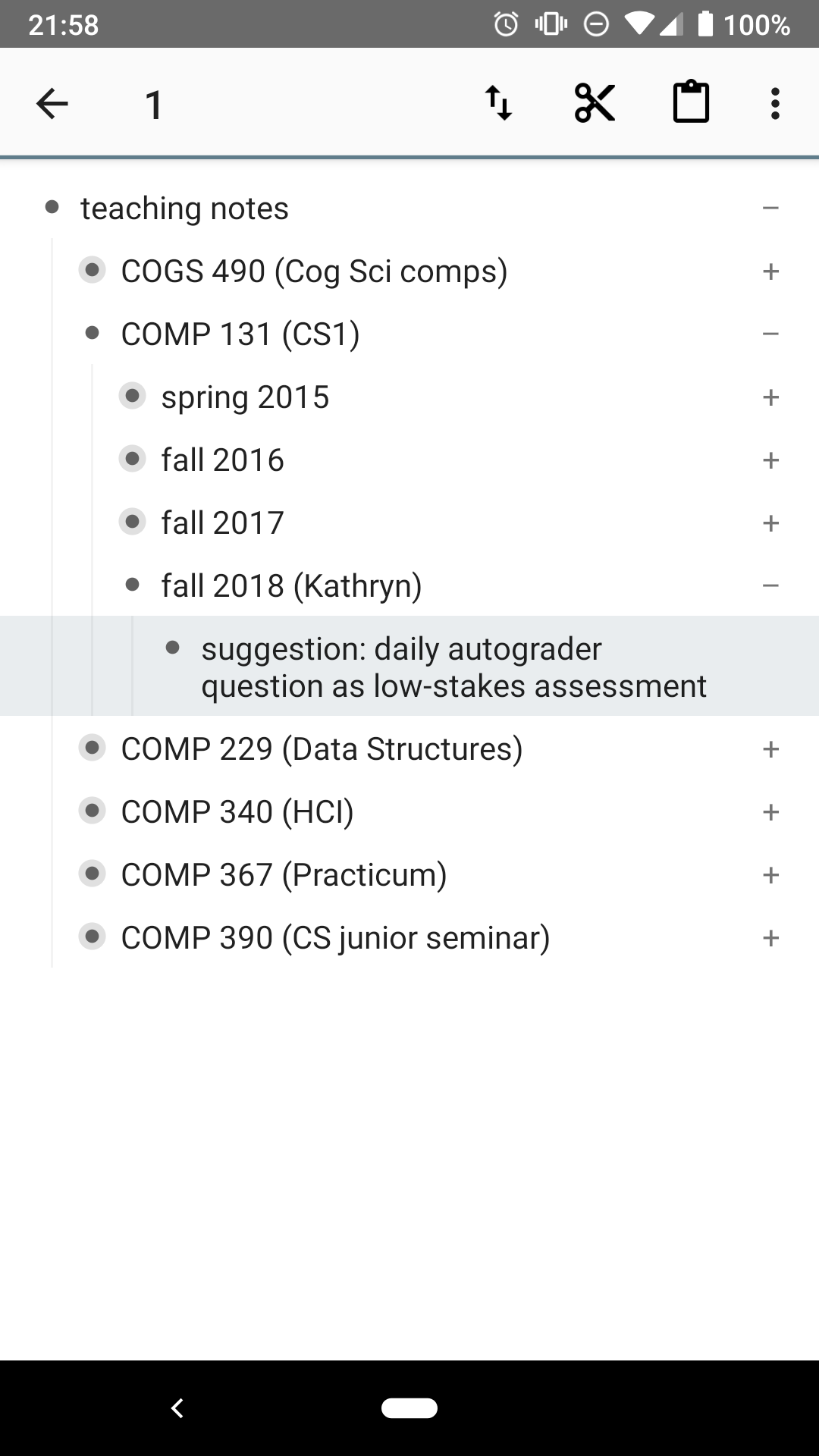
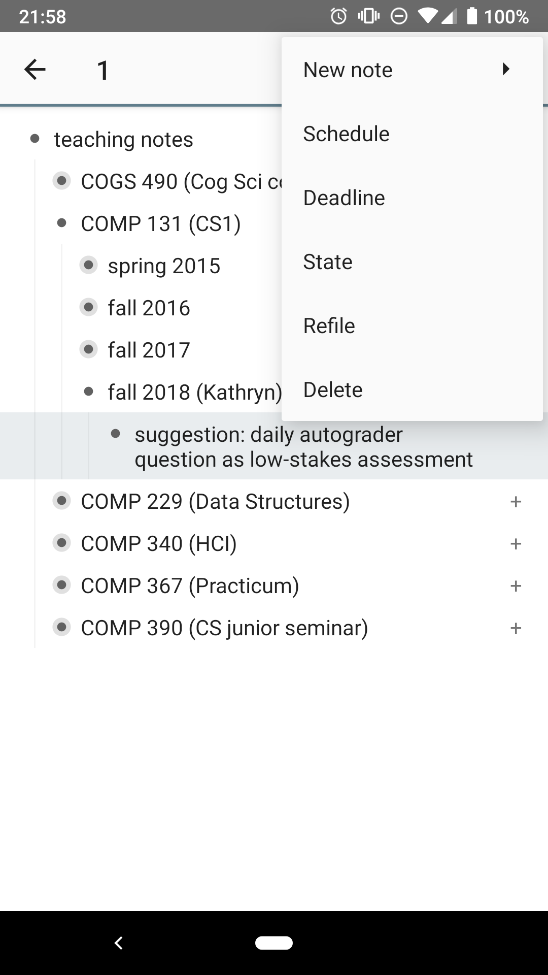
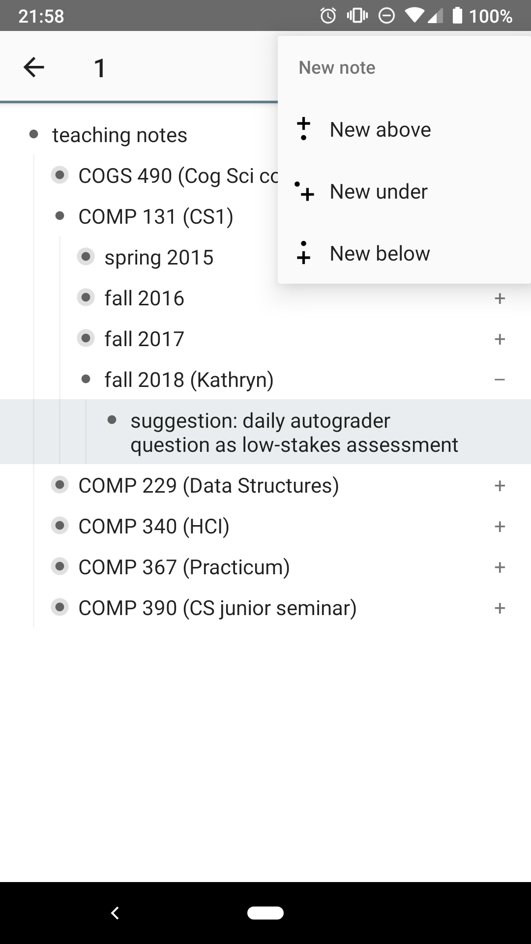
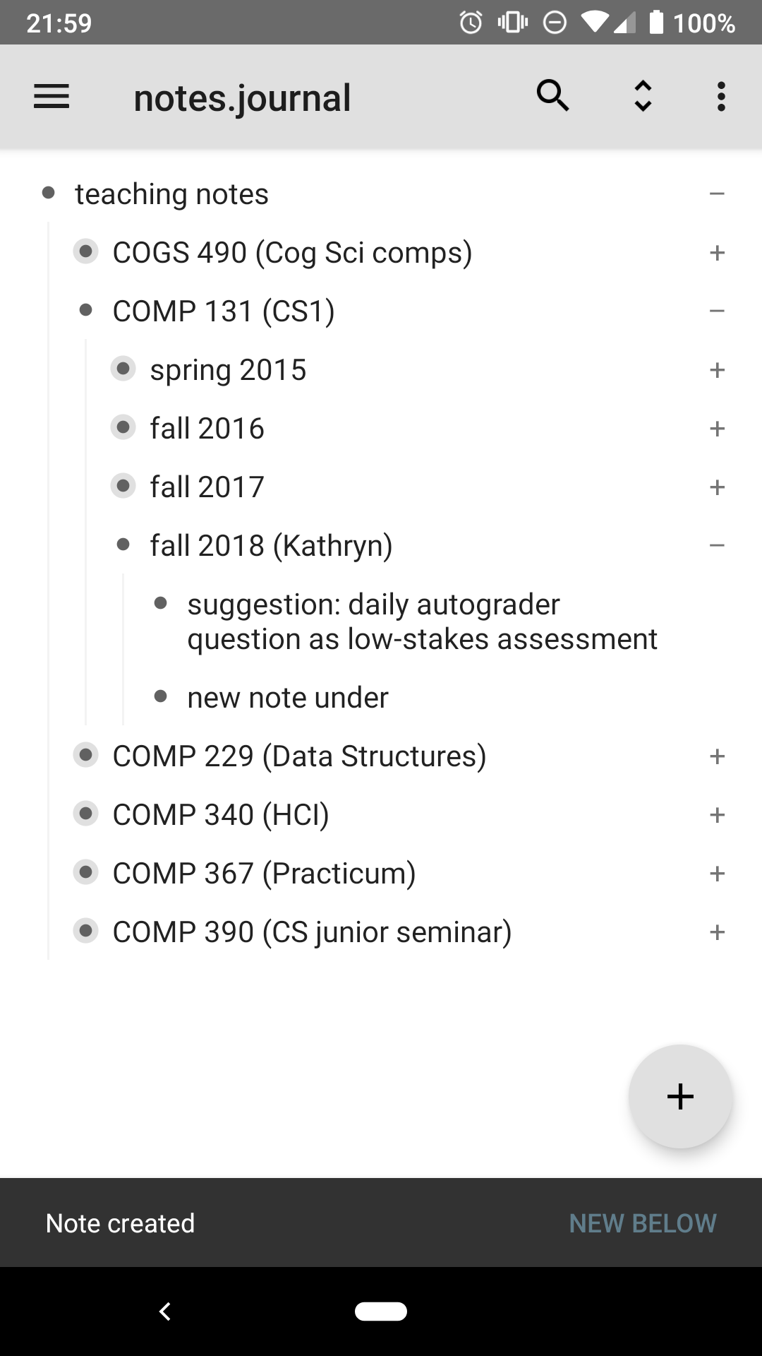
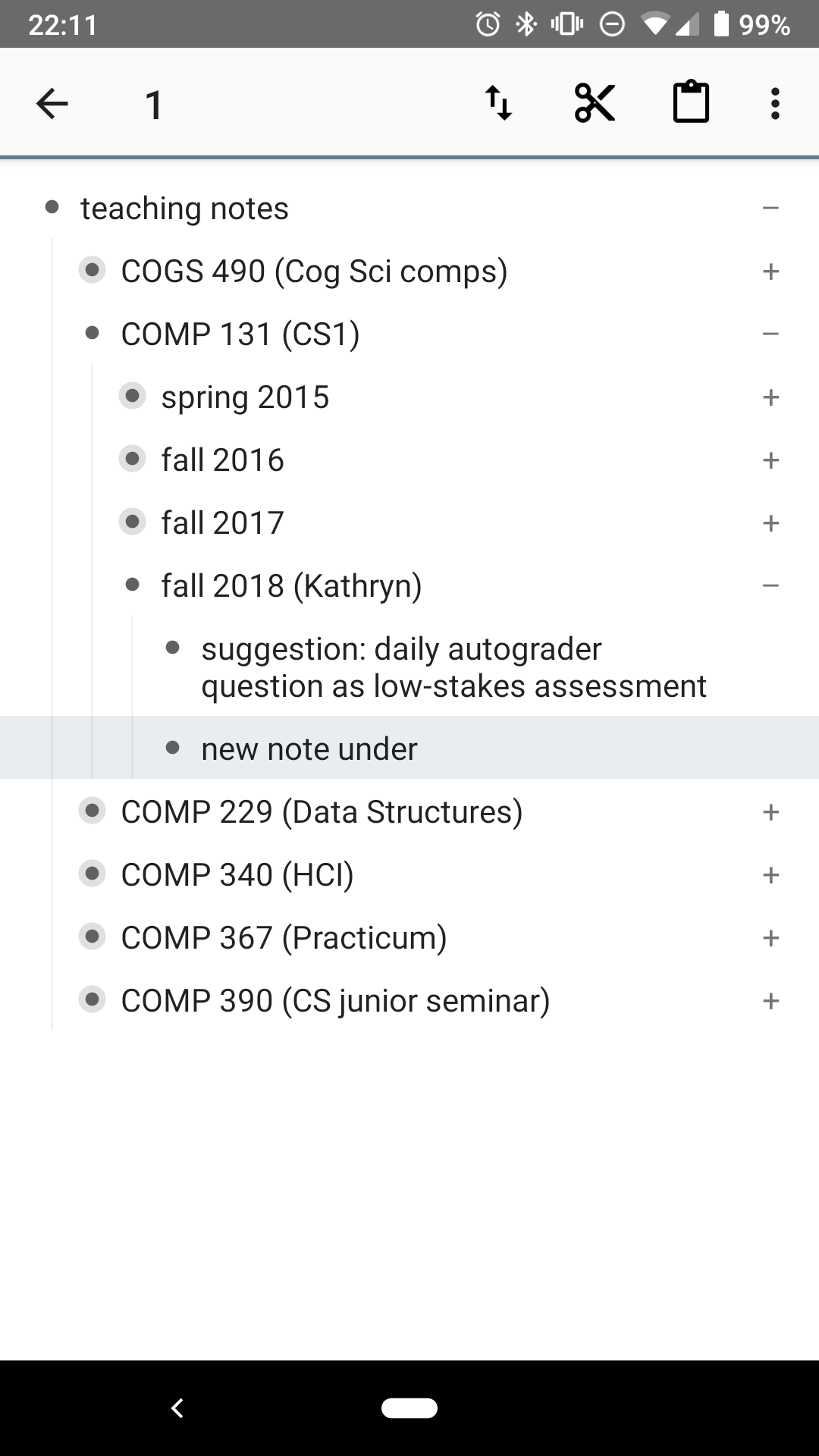
That may not be asking a lot, but making all of that intuitive and fast is harder than it would seem. As an example, let's take a look at two other apps I've used: Orgzly and WorkFlowy. The best thing I can say about Orgzly is that it's open source - the entire codebase is on GitHub. But the user interface leaves a lot to be desired. In particular, it takes a whopping five taps to add a new note, an unacceptable amount of friction for such a common task:
- Select the place to add the new note.
- Open the menu.
- Select "New Note"
- Select "New Below"
- Write the note and save
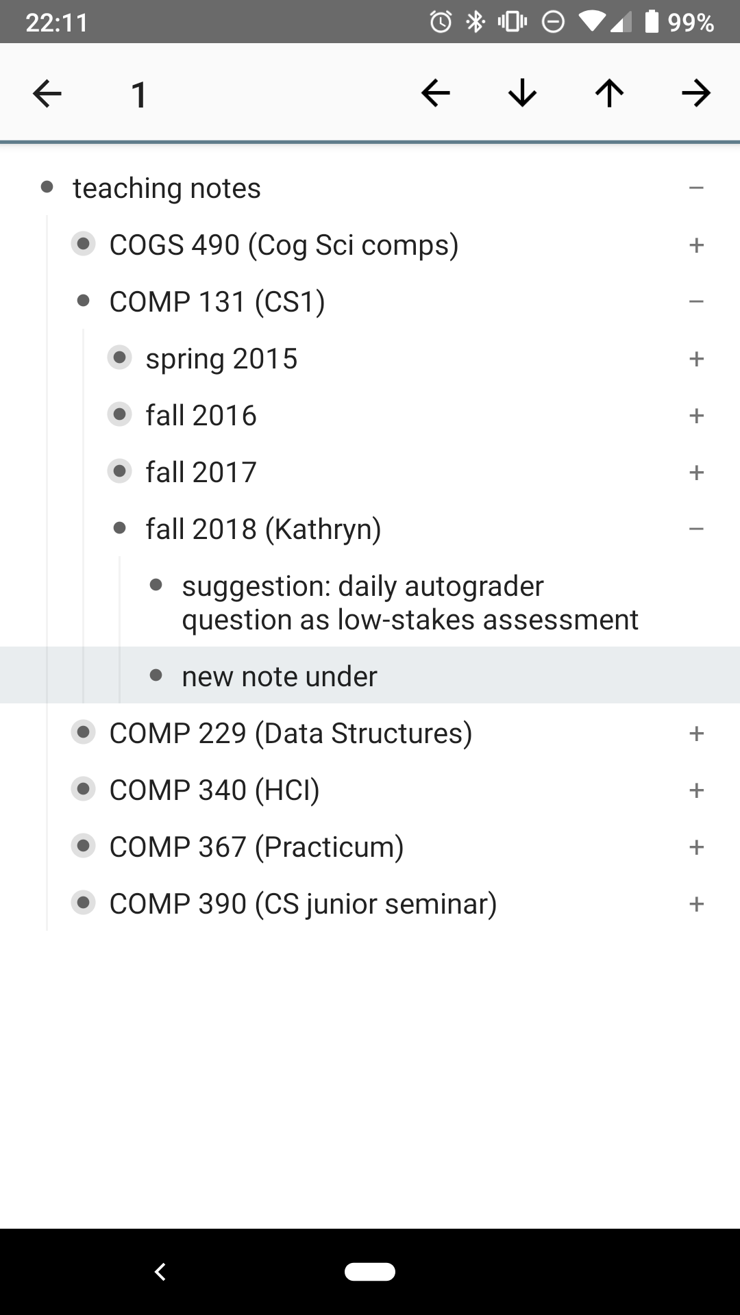
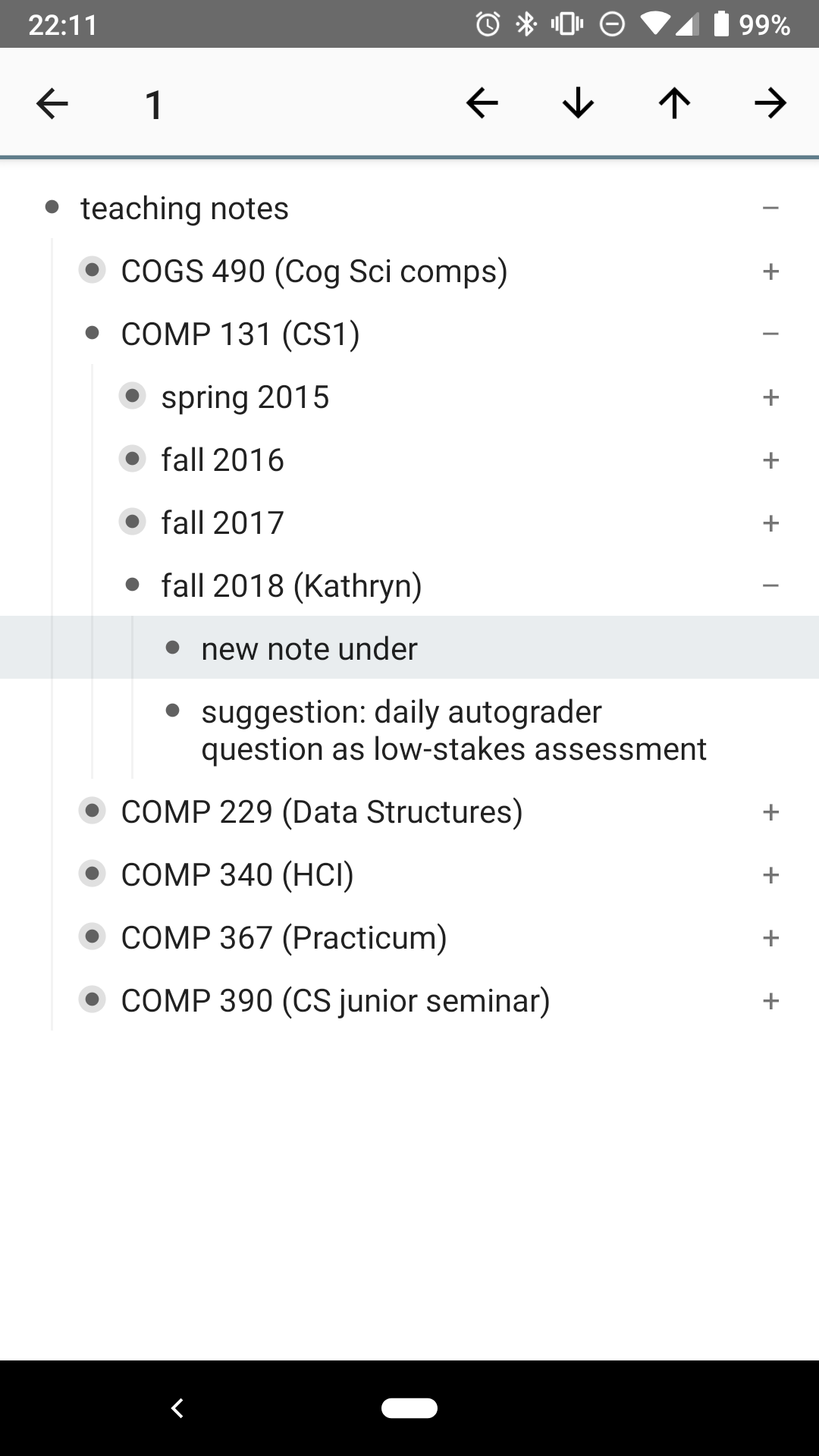
It's possible to move sublists, but that another two taps from the move menu  . At least the movement buttons stay visible so you can move notes several steps up or down:
Comparatively, WorkFlowy is much simpler. Adding a note is simply pressing Enter from the note above. WorkFlowy also has buttons for indenting and dedenting notes, but not for moving them up and down. To do that, you can long-press a note, then drag it to the desired location. On the other hand, WorkFlowy does have one new feature: you can click on the bullets to zoom in on a particular sublist. The breadcrumbs at the top shows which sublists you are in, and lets you jump back out to the full list.
My biggest issue with WorkFlowy is that, with a free account, you are only allowed to create 100 notes per month. Given my habits, I would use up that quota within a week, and while I wasn't opposed to paying for WorkFlowy, I was never particularly enamoed with the app in the first place anyway.
Dynalist: Appearance
And so I discovered Dynalist several weeks ago. Functionally and even visually, Dynalist is very similar to WorkFlowy - in fact, the founders were WorkFlowy users until they ran into missing features. The app allows you to make arbitrarily nested lists, lets you "zoom" into sublists, and has the additional features to add checkboxes, due dates, and so on.
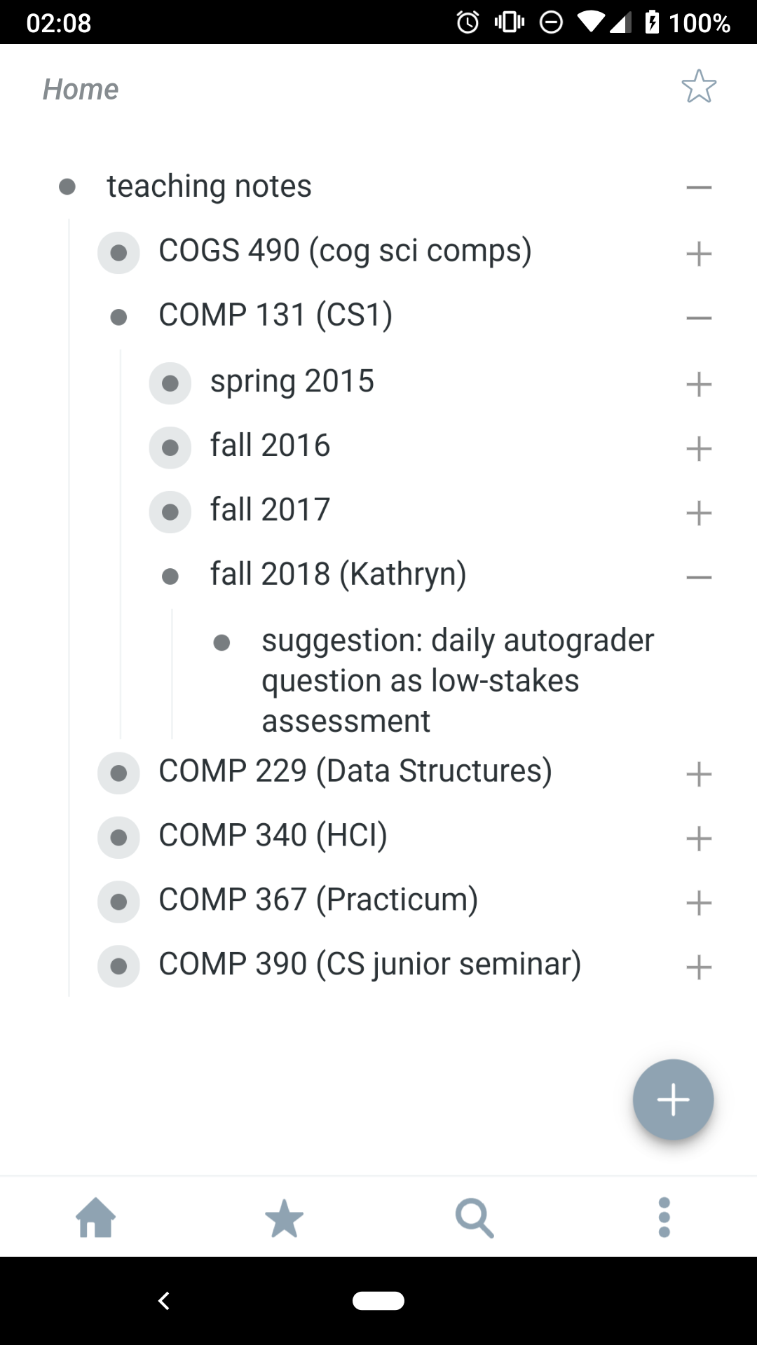
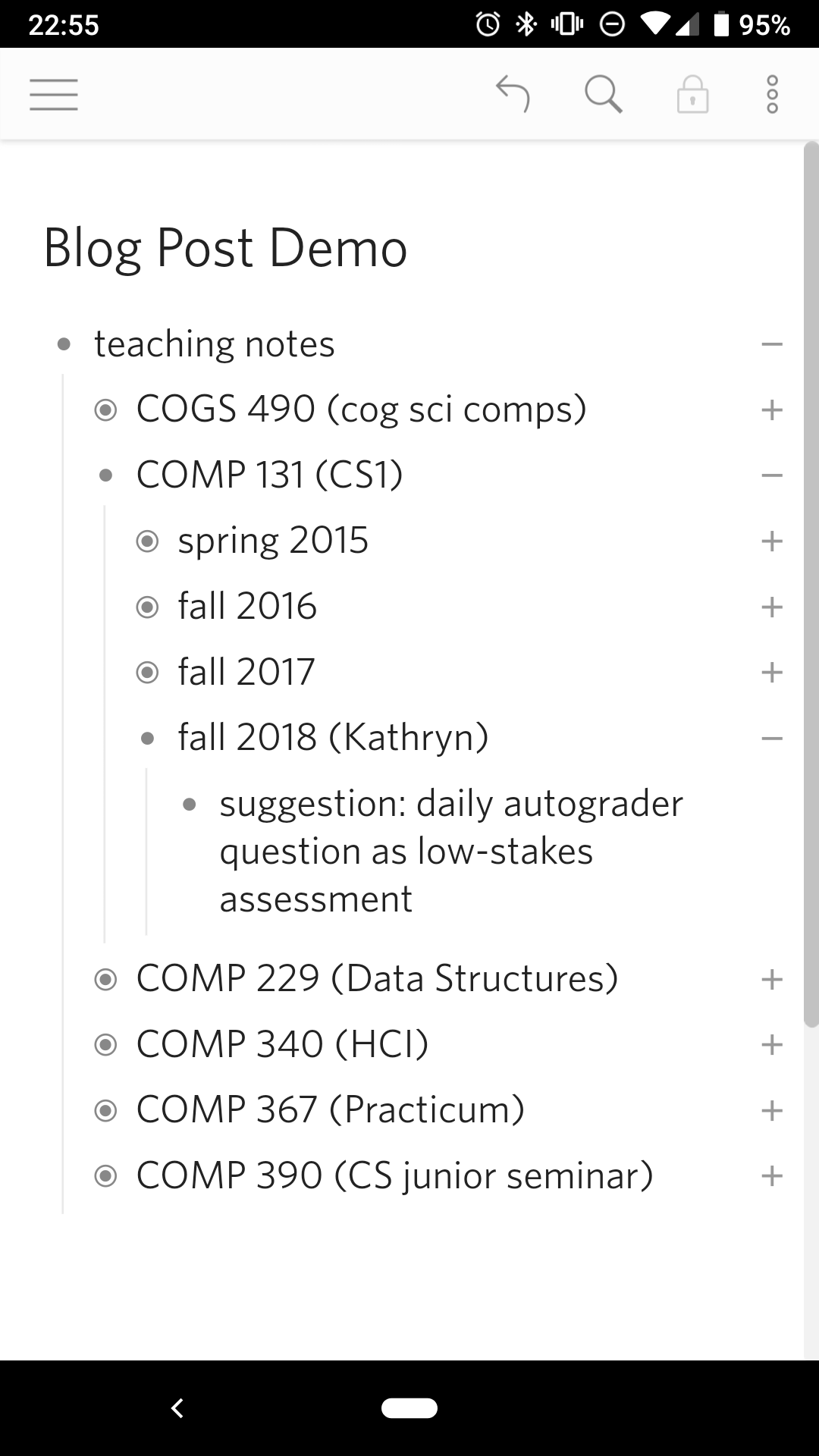
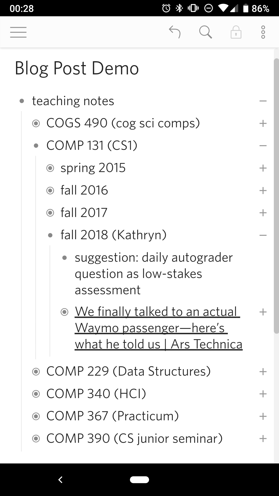
When the app first opens, the first screen you see is the last "document" you've edited. Dynalist allows you to organize your notes into folders and documents from the hamburger menu, but since I don't use these features, I will ignore them here. The Dynalist home screen is pretty minimalist - the majority of the screen is taken up by my notes, with a small toolbar at the top. A small brightness difference is used to highlight which buttons are active, and the icons mostly follow convention: the hamburger menu, undo, search, and at the far right, another smaller "additional items" menu. The only icon that is unclear is the lock, which with a little experimentation shows that it puts the notes into read-only mode.
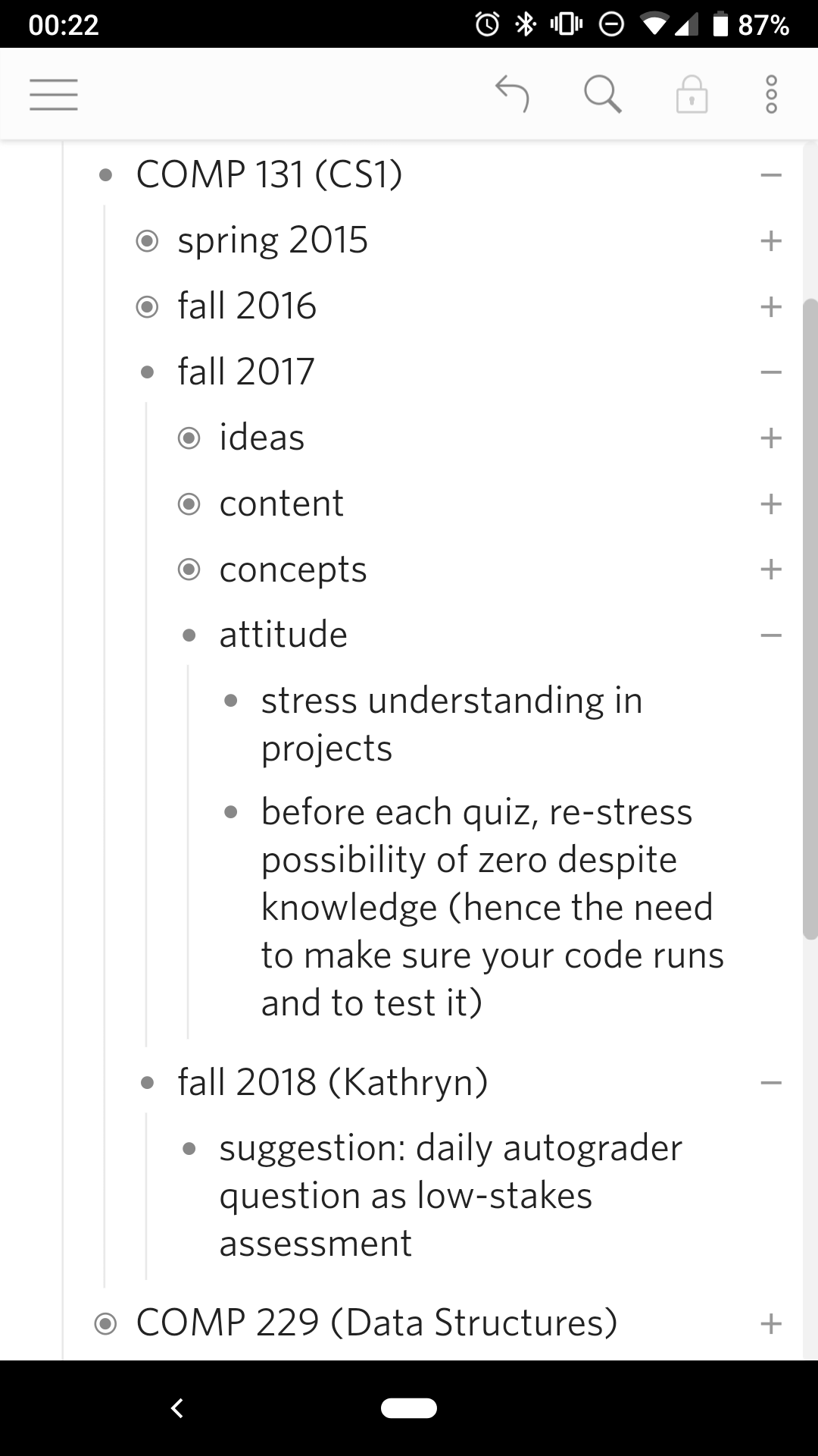
Since the entire app is in grey scale, none of these buttons draw attention away from the notes. The grey scale and high contrast also mean that people with colorblindness will not have any trouble with the app; the user can also change the font size in the settings. The title is in slightly larger typeface to emphasize it's importance and to locate the user, but otherwise is the same black-on-white as the contents. The notes themselves are organized hierarchically, with a slight indent to indicate nesting - a convention taken from programming and from nesting folder structures, which both Orgzly and WorkFlowy also adopted. This hierarchy is further reinforced by the vertical line that runs down the left side between sibling notes, guiding the eye towards notes at the same indent.
Dynalist: Editing
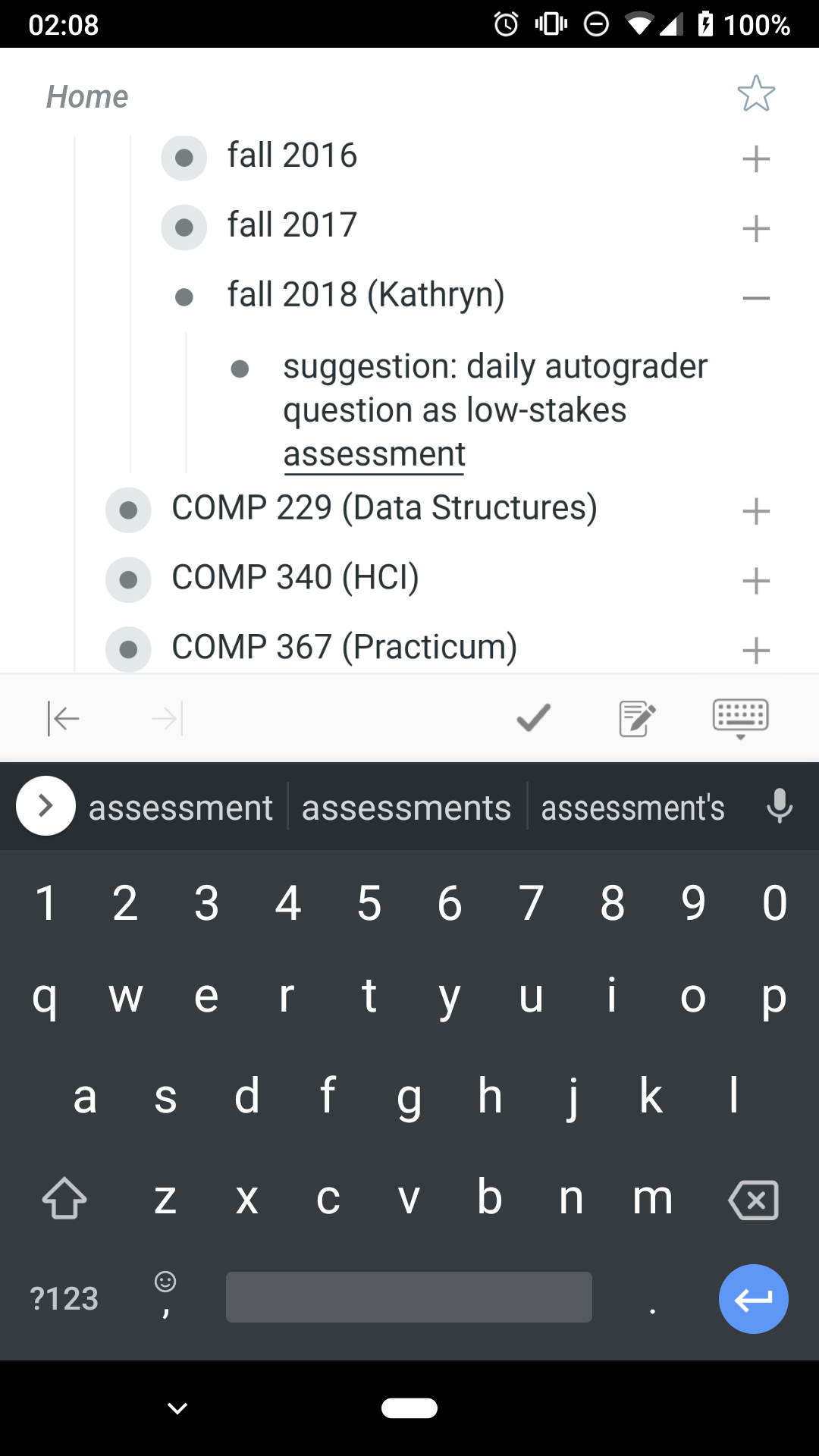
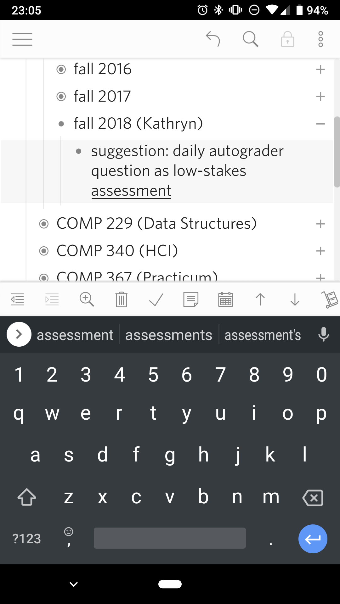
Since the most frequent action in a note-taking app is to edit the notes, Dynalist conveniently makes this the easiest action. Tapping on any item pops up the keyboard, after which all the standard controls are available. The item is also highlighted, although the contrast is relatively low, making it hard to notice. Pressing enter while editing an item will create a new item below; this makes it easy to create multiple items one after the other. Pressing enter in the middle of an item will split it in two, and doing it at the beginning will insert a new item above. There is an invisible design choice here: Dynalist could have allowed multi-line items (which is possible in Orgzly), but instead chose to use the enter key to create new notes instead. Given that multi-line items are relatively uncommon, this choice optimizes for the common case.
n
Next to editing items, the second-most common task is to move items. This is accomplished by the buttons in the editing toolbar above the keyboard -  to indent,
  to dedent,
  to move it up,
  to move it down, and
  to delete. Although no conventions exist for these actions - except perhaps the trashcan for delete - their meaning is relatively clear within the context of a nest list.
Like WorkFlowy, notes can also be reordered by dragging, but WorkFlowy has a slightly better interface in this case. In WorkFlowy, any part of the line can be used to drag the note; in Dynalist, you have to drag the bullet, which is much harder to hit. In WorkFlowy, the lack of a button to move items up and down forces the user to try other actions, but in Dynalist the buttons are already visible. Although both apps follow the Android convention for deleting - a long-press followed by a button - WorkFlowy makes this feature much easier to discover. At the same time, because Dynalist has buttons for rearranging items, dragging became unnecessary; in fact, I didn't realize that dragging was possible until now. Still, a better signifier that drag-rearranging is possible and a larger contact area for that action would be helpful.
By making the movement buttons on screen and directly available, Dynalist traded screen clutter for task efficiency. (Compare Orgzly's kludgy method of rearranging notes.) I cannot say the same for the other items on the bottom toolbar. The basic movement buttons are scattered among other buttons for adding due dates, crossing out items, adding checkboxes. While the movement buttons are at least recognizable, the advanced buttons are indecipherable. With this many buttons, the toolbar actually scrolls sideways and extends off screen, which is difficult to discover. Since I don't use these other features, my preference would be to have settings that let me select which buttons will appear (and ideally, in what order). Short of that, tooltips that pop up with a long-press would at least help users figure out what those buttons do.
Dynalist: Viewing
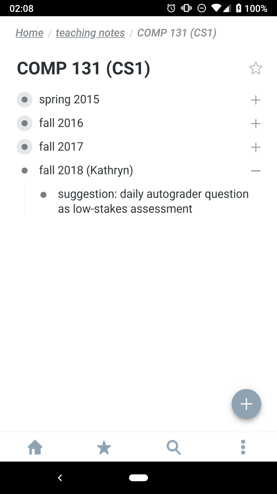
The final main features of Dynalist is for viewing notes. Like WorkFlowy, Dynalist lets you hide subitems and zoom in on a sublist; both apps do this with the +/- icons on the right and the dots on the left respectively. Neither icons are well-signified as buttons because of how they both serve other functions: the bullet obviously to identify each note, but in fully-expanded documents, the remaining "-" icons do the same. Simultaneously, the +/- symbols clearly indicate whether an item contains a collapsed sublist, and this is signaled a second time with a ring about the bullet.
Interestingly, the zoom function is duplicated by a zoom button  in the toolbar. I am mildly surprised that this is not the case for collapsing/expanding a sublist. In fact, Orgzly has a button
  that expands or collapses all items; a similar icon could be provided in the toolbar for users to discover.
My biggest critique of both the collapse/expand and the zoom icons, however, is that they are both only a short distance away from the item text. While I can semi-reliably tap the icons, I tend to missed-tap if I try to edit an item at the end of a line. This is especially problematic for links, where a missed-tap will open the browser. The right side of a line is crowded in general, as four functions with tiny tapping targets are snuggly nested next to each other. From left to right:
- Tapping on a link will open that link in the browser
- Tapping on whitespace will pop up the keyboard for editing
- Tapping on the +/- icon will expand/collapse the item
- Tapping/dragging the scrollbar will move through the notes
If I were to tweak the Dynalist app, it would be to allow long-presses to trigger editing. This would remove the frustration of repeatedly failing to edit a link, and provide reasonably-sized targets for three of the four tasks (and providing an alternate method to accomplish the last one). Although this means that long-press cannot be used for drag-rearrange, the current design of Dynalist already uses a small target for this interaction. At least for me, I run into the missed-tap problem a lot more frequently (about once a week) than I do a failure to drag-rearrange my notes (which is never).
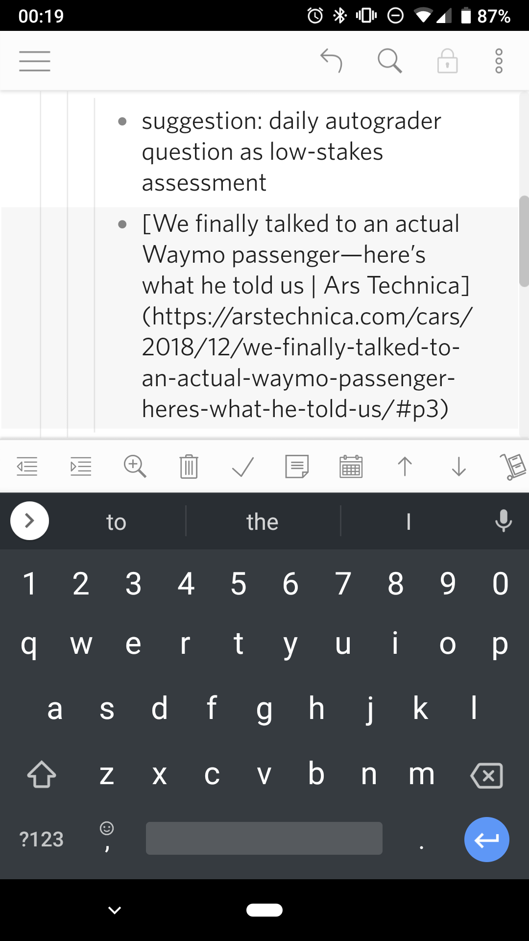
(Speaking of links, a minor frustration is that Dynalist uses Markdown for formatting. For example, to create a link to Google that shows up as "Google", you can write [Google](https://www.google.com/). Dynalist will display this as the link text, but will show the URL when editing. The sudden appearance of a lot of text is jarring, and the visual discontinuity often takes me a second to find my cursor. This change in text also breaks the standard mental model of what-you-see-is-what-you-get (WYSIWYG) editing.)
Conclusion
Despite my annoyance with the crowded, indecipherable toolbar and the crowded, untappable right side, the Dynalist is an intuitive and efficient note-taking app. Unlike Orgzly and WorkFlowy, all the editing and viewing functions are available at once, greatly reducing the friction for common tasks like adding a note or rearranging items. Reading my notes on Dynalist works well, with an expand-/collapse-all button being my only suggestion. Dynalist has made taking notes on my phone almost as easy as it is on my laptop, and maybe even more joyful. I won't give up my vim note system any time soon, but in the mean time, I am happily surprised that Dynalist has let me take notes on my phone.
