2018-11-01
Author's Note: I am writing this blog post to provide a positive example of what I would like to see in a design critique for my HCI students. You can jump straight to the critique if you just want to see the app.
Preamble
I've never found a note-taking app that I've liked.
I have an extensive personal information management system. My system grew out of keeping 16+ years of a personal journal, where I start by keeping daily notes, which are then converted into sentences every couple days to a week. This system expanded to include a research journal during grad school, and it also tangentially touches on a to-do list and my collection of research papers. All of it is managed by editor keyboard shortcuts and a couple scripts that I've written over the last six years.
Although I am generally happy with this system, the amount of work I have put in has made me curious how other people organize their lives. Whenever I see a notebook on Kickstarter - and there's a lot of them - I have to click on it to see how what guidelines their pages offer. I have looked at and tried most of the major digital note-taking and outlining apps including, in alphabetical order, Evernote, Ginko, Google Keep, Notational Velocity, Orgzly, TiddlyWiki, WorkFlowy, Wunderlist, and Zotero. At this point, it would not be an overstatement to say that I'm obsessed with note-taking systems.
To be fair, I am not sampling these apps just for idle curiosity. If there's one aspect of my system that I still struggle with, it's how to take notes while away from my computer. I used to always carry a Moleskine cahier - I still keep one in my bag most of the time - but since owning a smart phone, I have slowly transitioned to typing my notes instead. I originally just typed into a text editor, then later into email drafts so it would automatically sync to my computer. But integrating it remained a hassle, and it lacked the collapsible hierarchy that I've gotten used to. This is why so many of the programs I've tried offer mobile apps.
Dynalist: Appearance
Then several weeks ago I discovered Dynalist. Functionally, Dynalist is very similar to WorkFlowy - the app allows you to make arbitrarily nested lists, lets you "zoom" into sublists, and has additional feature to add checkboxes, due dates, and so on. What I want do in this post is critique the current design of Dynalist, as although it is the closest it has come to my ideal app, it is not without it's flaws.
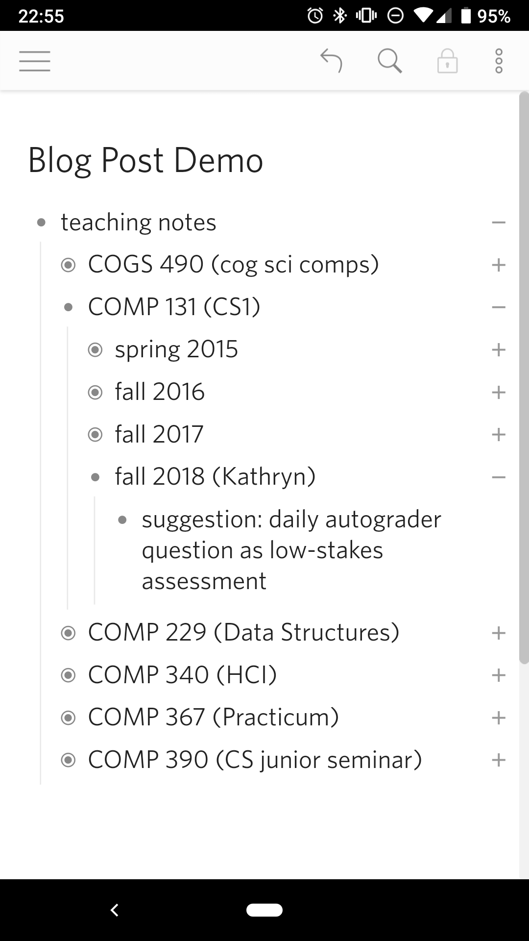
When the app first opens, the first screen you see is the last "document" you've edited. Dynalist allows you to organize your notes into folders and documents from the hamburger menu, but since I don't use these features for the most part, I will ignore them here. The Dynalist home screen is pretty minimalist - the majority of the screen is taken up by my notes, with a small toolbar at the top. A small brightness difference is used to highlight which buttons are active, and for the most part the icons follow convention: the hamburger menu, undo, search, and at the far right, another smaller "additional items" menu. The only icon that is unclear is the lock, which with a little experimentation shows that it puts the notes into read-only mode.
Since the entire app is in grey scale, none of these buttons draw attention away from the notes. The grey scale and high contrast also means that people with colorblindness will not be disadvantaged. The title is in slightly larger typeface to emphasize it's importance and to locate the user, but otherwise has the same white-on-grey as the contents. The notes themselves are organized hierarchically, with a slight indent to indicate nesting - a convention taken from programming and from nesting folder structures. This hierarchy is further reinforced by the vertical line that runs down the left side between sibling notes.
Dynalist: Editing
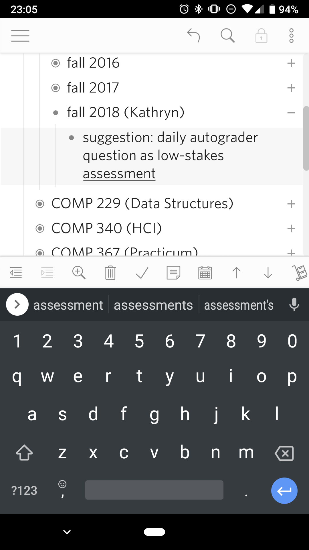
Since the most frequent action in a note-taking app is to edit the notes, Dynalist conveniently makes this the easiest action. A tap on any item pops up the keyboard, after which all the standard controls are available. The item is also highlighted, although the contrast is relatively low, making it hard to notice. One difference in the editing is that pressing enter while editing an item will instead create a new item below; this makes it easy to create multiple items one after the other. Pressing enter in the middle of an item will split it in two, and doing it at the beginning will insert a new item above. Although it's possible to have allowed multi-line items, Dynalist instead co-opts the enter key for a common task in its nested list context.
FIXME links
Next to editing items, the second-most common task is to move items. This is accomplished by the buttons in the editing toolbar above the keyboard -  to indent,
  to dedent,
  to move it up,
  to move it down, and
  to delete. Although no conventions exist for these actions - except perhaps the trashcan for delete - their meaning is relatively clear within the context of a hierarchical list.
The buttons aside, the editing toolbar as a whole is less then perfect. The conventional affordance for moving items in a list is to long-press and drag, which does not work in Dynalist. There may be technical reasons for this - it's unclear whether dragging will work for nesting - but disabling this even for within-list movement may cause some confusion. Deleting also has a convention, to long-press to select followed by a button. This is somewhat followed, but the selection is only implicit in that you are editing that item.
The toolbar itself has other problems. The basic movement buttons are hidden among buttons for adding due dates, crossing out items, adding checkboxes, and so on. While the movement buttons are at least recognizable, the advanced buttons are indecipherable. The issue of the editing toolbar is a common one, a tradeoff between making basic tasks obvious and advanced tasks efficient. There are really two problems here: one of comprehension, and one of simplicity. For comprehension, perhaps a long-press on a button could show a tool tip. This is not particularly helpful for me, since I don't use these advanced features. I care more about de-cluttering the edit tool bar, for which perhaps there could be a settings menu that would let me select which buttons will be shown
Dynalist: Viewing
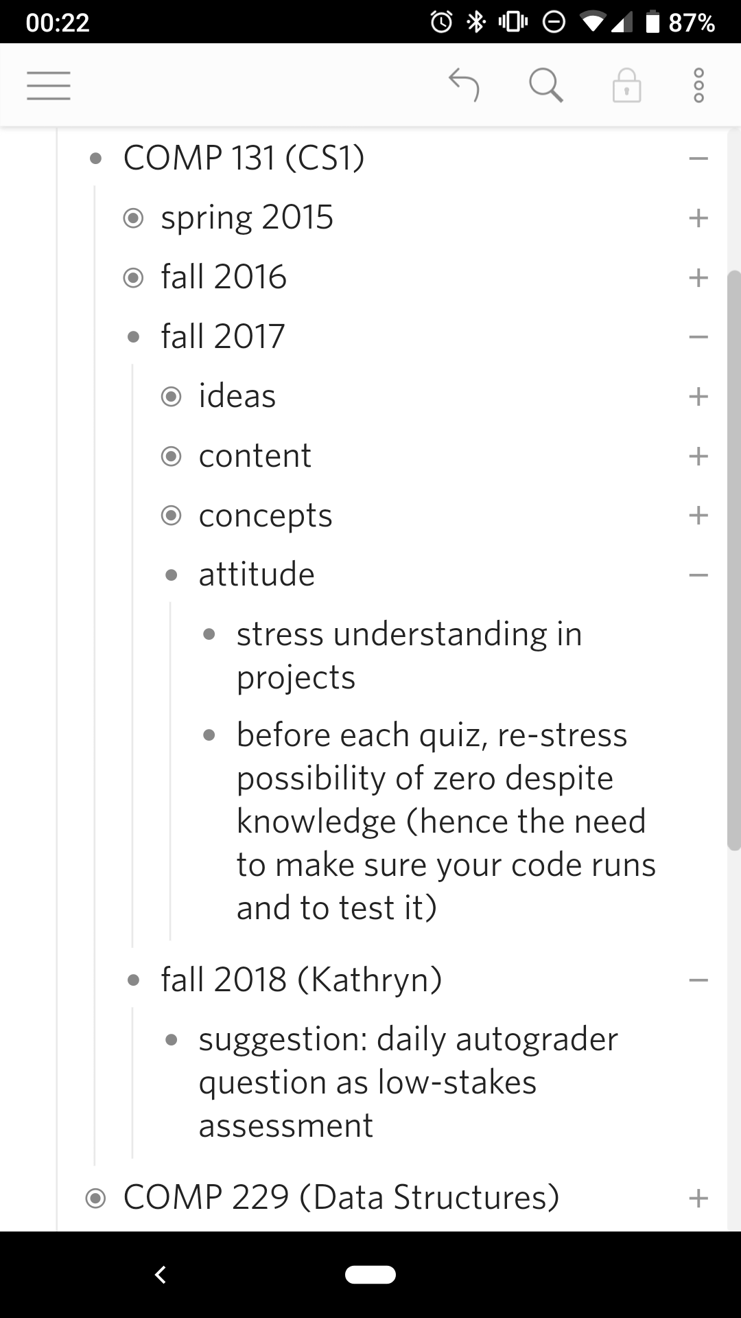
The final main feature of Dynalist and WorkFlowy is for looking over notes. Dynalist lets you hide subitems and "zoom" in on a list. In Dynalist, these are achieved by the +/- icons on the right, and by the dots on the left respectively. The affordance of expand/collapse buttons are better signified - in a fully expanded list, having "-" icons would serve no purpose. The zoom buttons, however, are slightly harder to discover. The buttons also serve to indicate the beginning of a list item, which may hide its functionality. This may be why Dyanlist also has a  zoom button in the toolbar. The dots in fact also show if an item has subitems that has been collapsed with an added circle. This change is small and not easy to notice, especially if the item is expanded/collapsed at the same time, which causes much bigger changes to the screen. However, it does provide a better visual cue that an item is collapsed, since it is closer to the item than the corresponding "+" sign.
My biggest critique of both the expand/collapse and the zoom icons, however, is that they are both only a short distance away from the item text. While the zoom and collapse/expand icons usually work, I tend to mis-tap if I try to edit an item at the end of a line. While it's possible to work around the problem, by tapping the middle of item to trigger the editing before moving the cursor, this solution is not idea. It's unclear whether additional spacing will help, or if it will reduce the usability of other parts of the app. Together with the links issue, however, I suspect that a slightly more general redesign may be necessary. FIXME suggestions?
Conclusion
FIXME syncing