Two Ambigrams
2013-11-21
Earlier this year I tweeted that I was excited about something that I couldn't reveal at the time. The something is actually an ambigram, which I design on occasion. I first learned of the idea from Dan Brown's Angels and Demons, in which ambigrams played a major role. Incidentally, the ambigrams in that book were designed by John Langdon, who commented on my previous post about ambigrams and psychology. I designed my first ambigram back in 2004, and have done several more since, mostly as gifts to people.
My best work up till the beginning of the year was a birthday gift I made for my friend Emily.
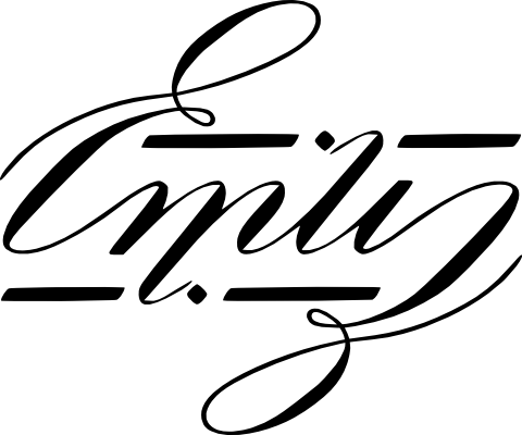
One interesting thing about this design is that there is no i. The m flows directly into the l; the i is an illusion created by the tittle above the last stroke of the m. I actually made a version with the i, but it isn't as elegant, and I stuck with this version.
The ambigram I made earlier this year was a going-away gift for my friend Laura, who moved to join her boyfriend Neale in Philly. Neale had moved there about a year ago, but I failed to make a gift for him then. The idea was therefore to make a gift for each of them. Having a complexity addiction, however, made me wonder whether I can make the two gifts interact somehow, to represent their relationship.
Long story short, here's the result:
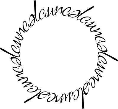
It's actually very difficult to see what's going on; it's better to show each one separately:
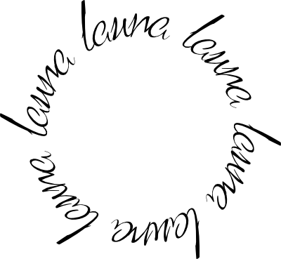
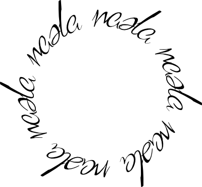
Individually, each half-circle isn't anything special: it's just their names in some fancy typeface. Together, however, is where the magic happens. The more observant of you will have noticed that the letters in laura and neale are not independent. In fact, they share all but the middle letter: the ra in laura turns into the ne in neale, and the le in neale forms the la in laura. Here is the combined circle again, with some highlighting: laura in red, neale in blue, and the overlap in purple.

The r/n were easy to merge; the crux of the design was in the a/e. It had to look good enough as both for each name to be readable; this was mostly done by adjusting the length of the closing stroke and of the swash. neale presented an extra challenge: if the e's can be read as a's, then what should happen to the remaining a? I was lucky in that a has two variants. Having used the single-story variant for the merged glyph, in the end I created the double-story variant from scratch, making a Frankenstein glyph from various bits of different letters.
The final part of this is the presentation. As you saw, the combined circle is hard read, which meant that each half-circle would have to be independent. I hit on the solution of printing each on a transparency, then put in a cardboard frame for sturdiness. This way, each card would individually show a single name:
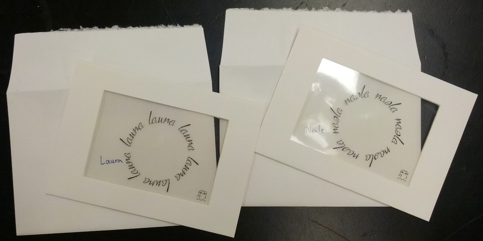
But when stacked and aligned, it shows the full ambigram:
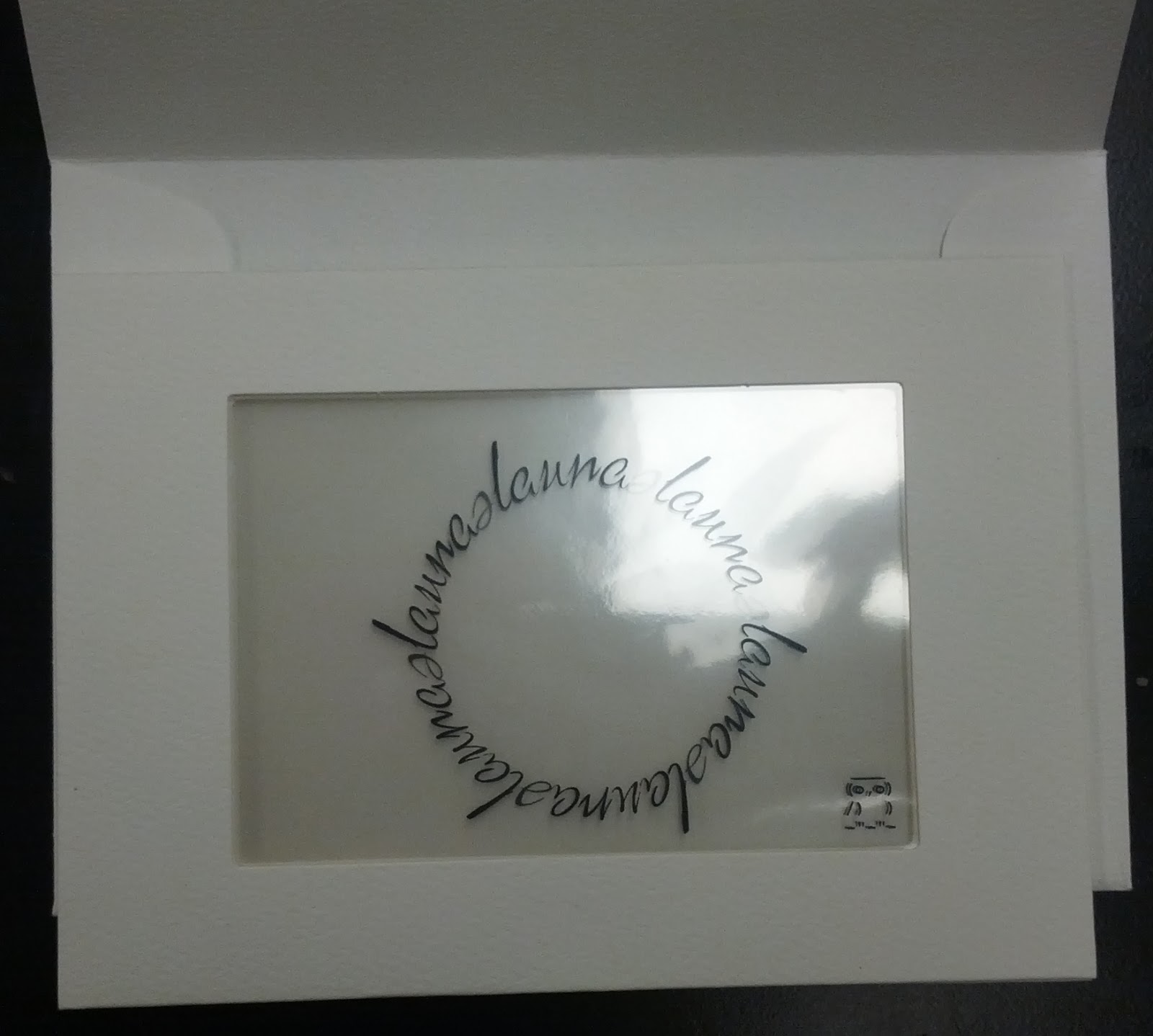
Typographically, I still like my emily card more, but in terms of the final product, this surpasses the former by far (which I had simply printed on cardboard). This is not just because you can fiddle around with the cards until they align, but because the re-interpretation of the letters is so unconscious. None of the few people I tested the ambigram on realized that the a changed to an e (or vice versa) until I pointed it out to them, despite them moving the cards into position and reading back out the individual names. This goes to show how powerful our preconceptions are in interpreting what we see.
I do not have any future ambigrams planned, although I do have a different art project in mind. Maybe I will share that when I'm done.