The Quantified Self
2013-11-11
This post means that I'm a third of the way through NaBloPoHaMo (National Blog Posting Half Month). So far I've managed to stay ahead of the posting schedule about two days, which is good because I'll be in Kentucky next weekend, without internet access. I don't expect there to be a problem, although I won't be able to announce new posts on Twitter. If I do fall behind, I'll make a special post to say so.
To celebrate this endeavor being a third done, and to give myself a break, this post will be mostly graphical. By "graphical", I mean "chartical" and "plotical"; these are all data visualizations of some data I have about myself. I'm not part of the quantified self movement, but I do have various pieces of collections of data about myself. My journal, for example, which I've kept for eleven years and has over 1.75 million words, is a rich source of information about myself. I've started projects to data-mine my journal multiple times, although I have never settled on a good enough method to do so. I also use Mint, which keeps track of my finances, and I use AskMeEvery to track my sleeping times (because I keep claiming that I don't need much sleep, but have never backed it up with data). There are a few other sources I could have drawn from to make pretty pictures as well, such as my command line history and my journal search history, and also my Google/Twitter/Facebook dumps, but I have less interest in those.
So here are three cool graphs. They are made with gnuplot, using Python for preprocessing. Having written the scripts for this post, the next step is to unify the scripts into pure Python. This will be a good excuse to learn matplotlib, which finally supports Python 3.

This first graph comes from my journal (and which I've shared on Twitter before). I measured the Flesch-Kincaid reading scale of each of my entries, then averaged the numbers for each month. I took the color scheme from a Dark Horse Analytics presentation, and I think it came out quite well. I was surprised how linear (slope = 0.38 grades/year) the result is, although there also seems to be a slight sinusoidal component that gets noisier over time. Before you laugh at my 9th grade writing level, I challenge you to calculate the same for your own recreational writing, while keeping in mind that most of the blog posts I've written in the past two weeks are around 10th grade. The only writing of mine that goes above that are my scientific publications, which rank in at 13th grade.

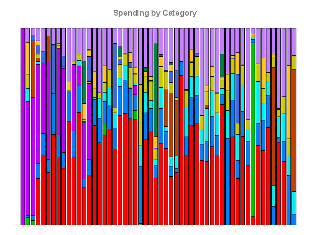
The second graph shows where my spending went over the last four years, since I started using Mint in 2009. There are eleven categories here, representing the ten categories with the largest total spending, with an additional catch-all "other" category. I've hidden the scale (or rather, it's all percentages), although you can probably figure out the real amounts if with some estimates. I will tell you that the red at the bottom is rent, and that the dark purple, on the left side, is credit card payments; you can tell when I've stopped using a credit card. Having made this graph specifically for this post, I have no insights, except that it would be fun to further analyze this data.

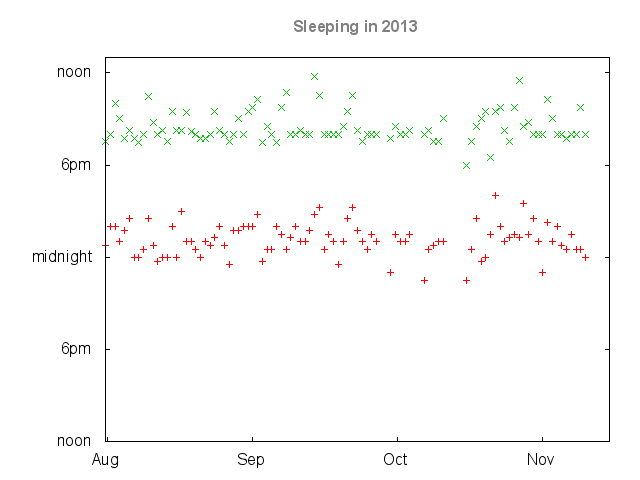
The last graph shows when I've gone to bed and gotten up in the last three months, at 15 minute resolution. The y-axis requires some explanation; it shows a day from one noon to the next, with the midnight being the transition to the day marked on the x-axis (which I've hidden anyway). There are some gaps for this data, notably in October, which all come from camping trips when I can't be bothered with clocks. In terms of summary statistics, min = 5hrs, first quartile = 6.75hrs, median = 7.25hrs, third quartile = 8hrs, max = 10.25hrs; the mean is 7.30hrs, with a standard deviation of 106 minutes. This is a below average amount of sleep, but not so low to be ridiculous; it only barely supports my claim that I don't sleep much (although it's silent on the issue of whether I need much sleep). In case you're wondering, my sleeping and waking times only have a correlation of 0.48, which is fairly low; I suspect that if I separate the weekdays from the weekends the correlation will be higher, but I have yet to do that analysis.