Some Trends
2011-02-13
I've been playing with graph creators lately. No, not the mathematical graphs... well, I mean... the other type of mathematical graphs (aka. plots). In particular, I was trying my hands at gnuplot, and of course I needed data. Where better than to plot trends from my own journal?
The x-axis shows time; each point represents the average over 6 months, taking the first/later half of the year. The y-value is the percentage of entries over this period which contains this word (or variants thereof; for example, the Twitter plot also includes the word "tweet"). This is all generated programmatically - I extended my journal script to calculate the percentage of entries containing given terms and output it in table (space-separated value) form, which gnuplot then reads. Since the data is highly specific, my gnuplot is also particular to this application. I abused gnuplot's ability to ignore non-existent columns and left it using 5 columns. The source is below:
1 2 3 4 5 6 7 8 9 10 11 12 13 14 15 16 17 18 19 20 21 22 23 24 25 26 27 28 29 | |
In the future I'm considering writing a script that generates gnuplot scripts. It'll be easier than remember all these ugly commands.
And here are the resulting plots. The first one is on my use of online services. You can clearly tell when I started using Reddit and how quickly it dominated my life. The growth of Twitter is much slower comparatively. Facebook is huge mostly because it's my main source of how other people are doing.
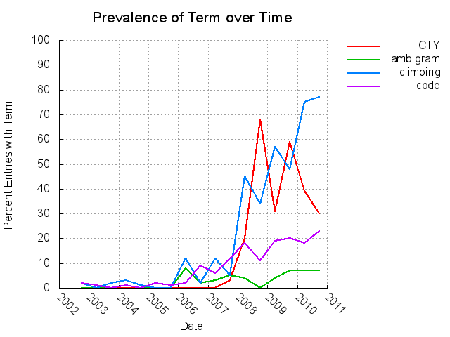
Next are some hobbies of mine, at least those I can think of off the top of my head. It's obvious when I started climbing more often (and therefore better); it's also clear that when I teach at CTY, it becomes a big part of my life. As a computer science major and now a grad student, I clearly code more than the chart shows; one could consider that as habituation, I guess.
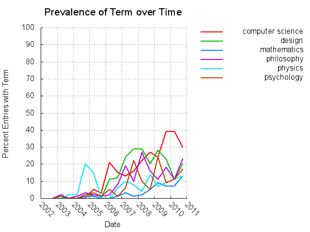
Here's another one, on academic topics. These were all topics I considered studying in college. I eventually majored in computer science and got a certificate in engineering design, but took extra classes in all these subjects. I think it's neat that these topics has all been mentioned more often over time - that I'm still into the same subjects I was in high school and college... except design, which I haven't done any of since junior year.
I would love to do more of these, but I can't think of anymore sets of terms to compare. Comment if you can.


